
packaging.

-
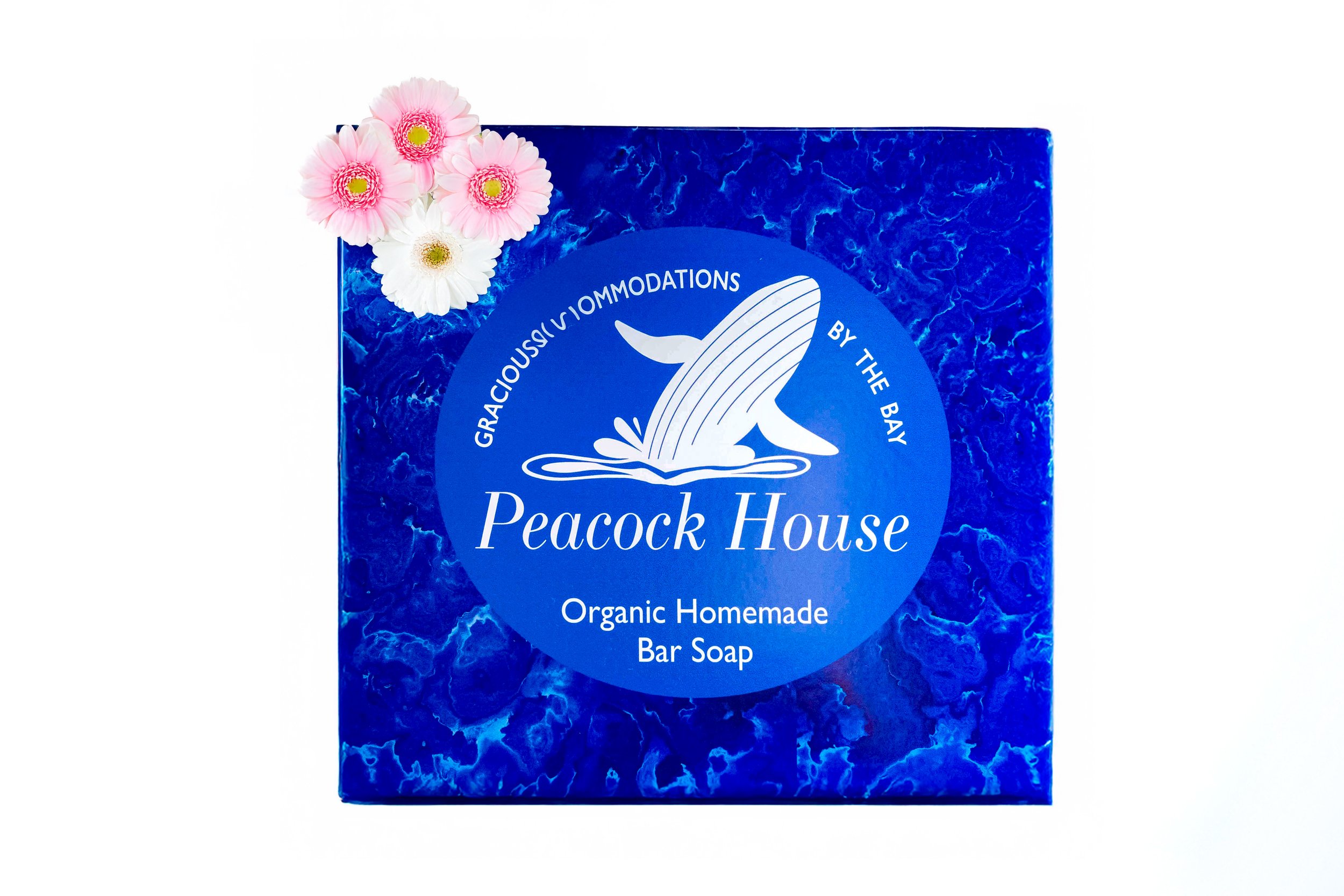
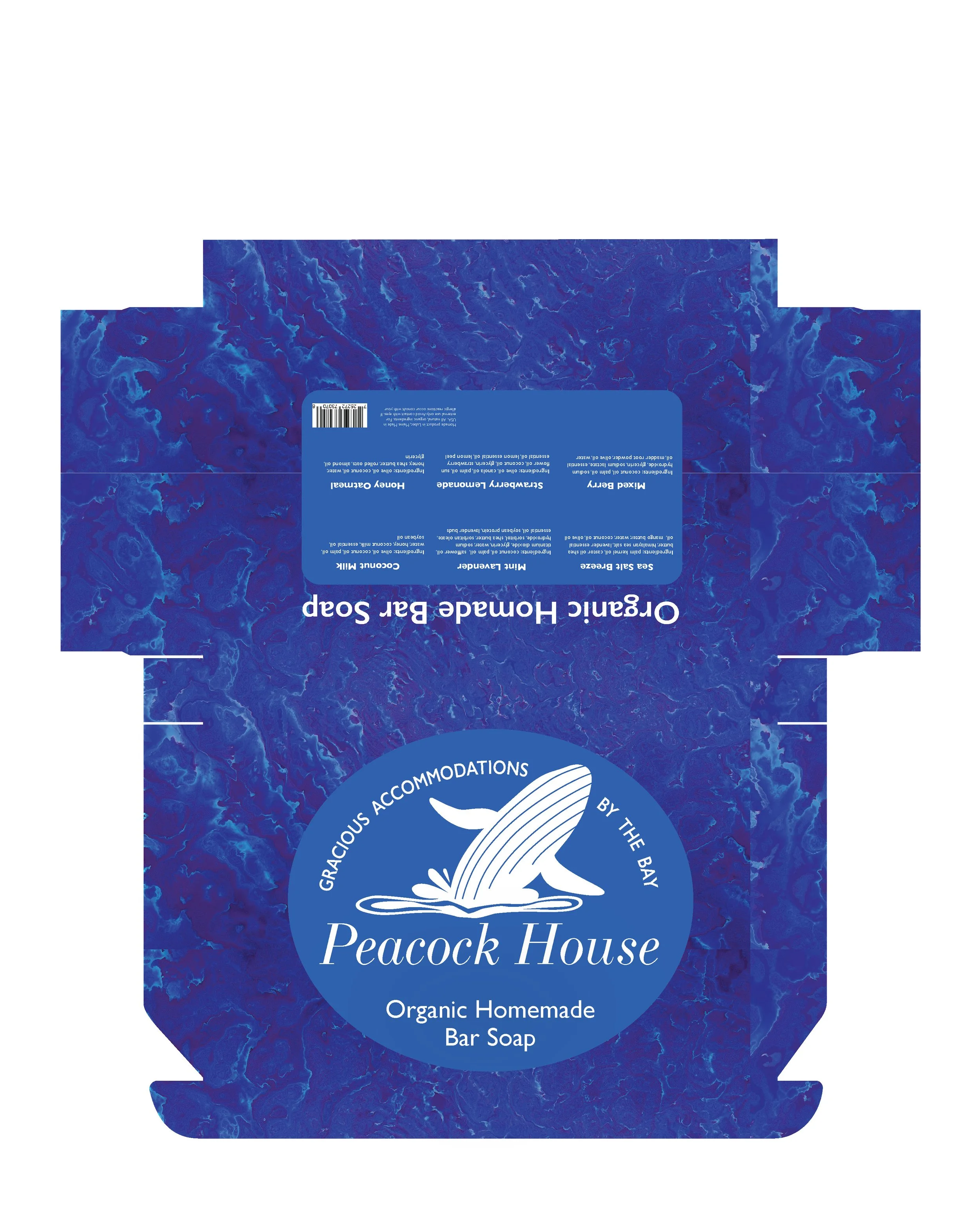
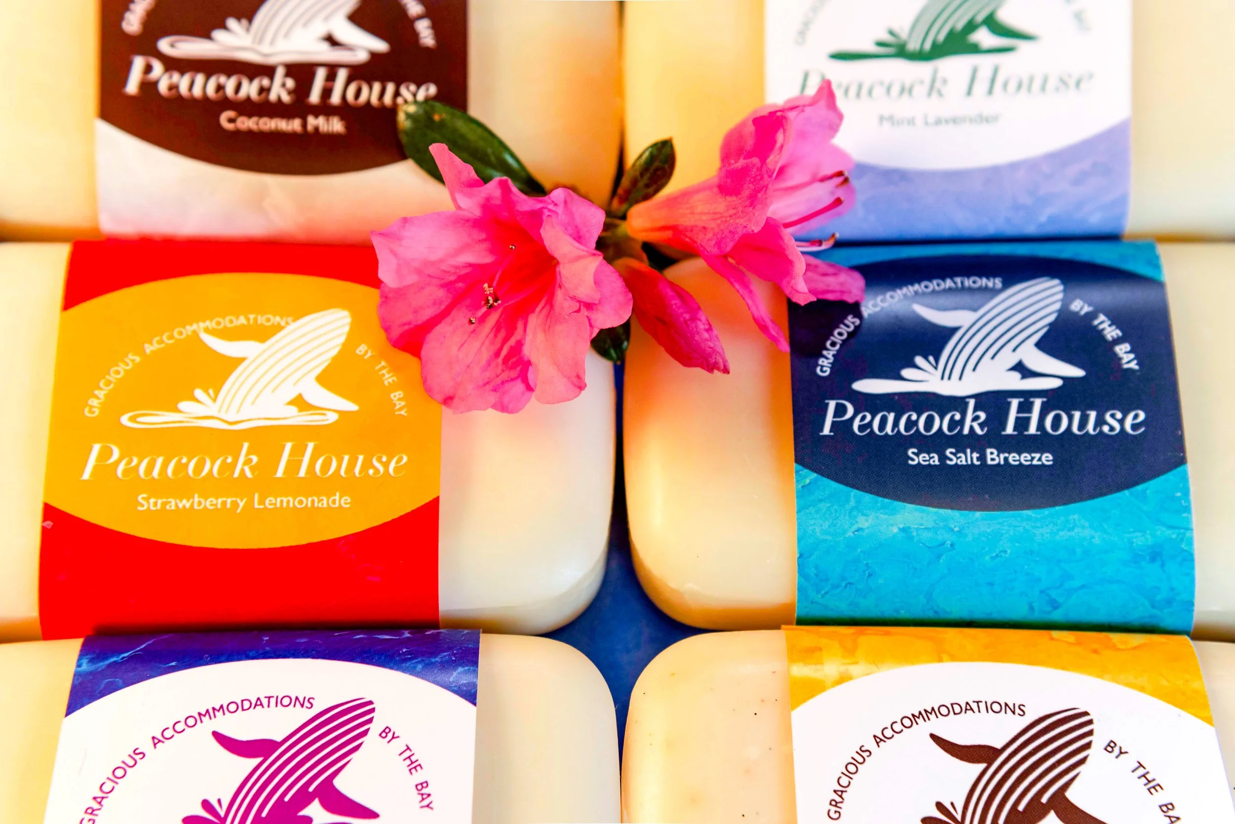
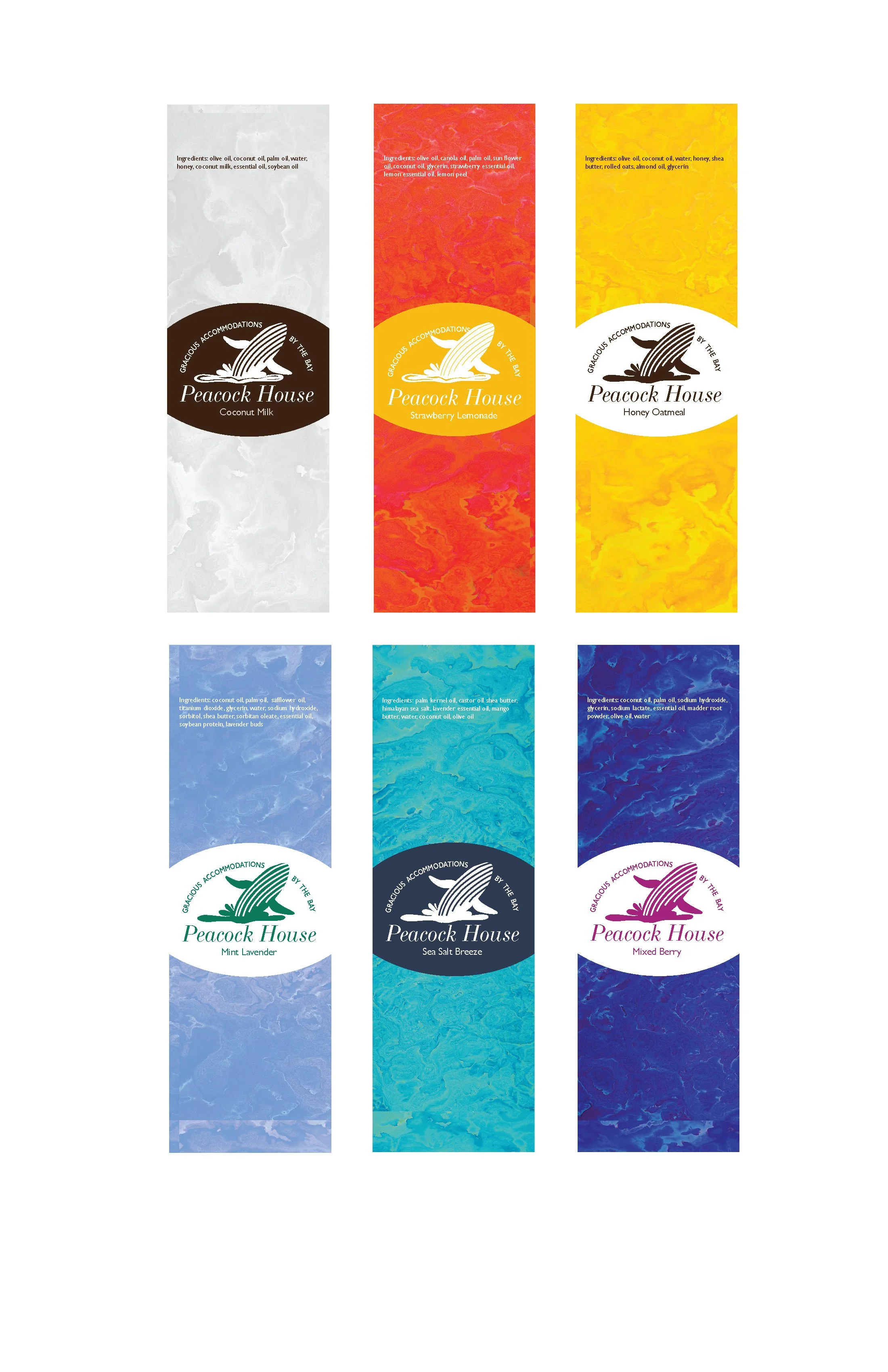
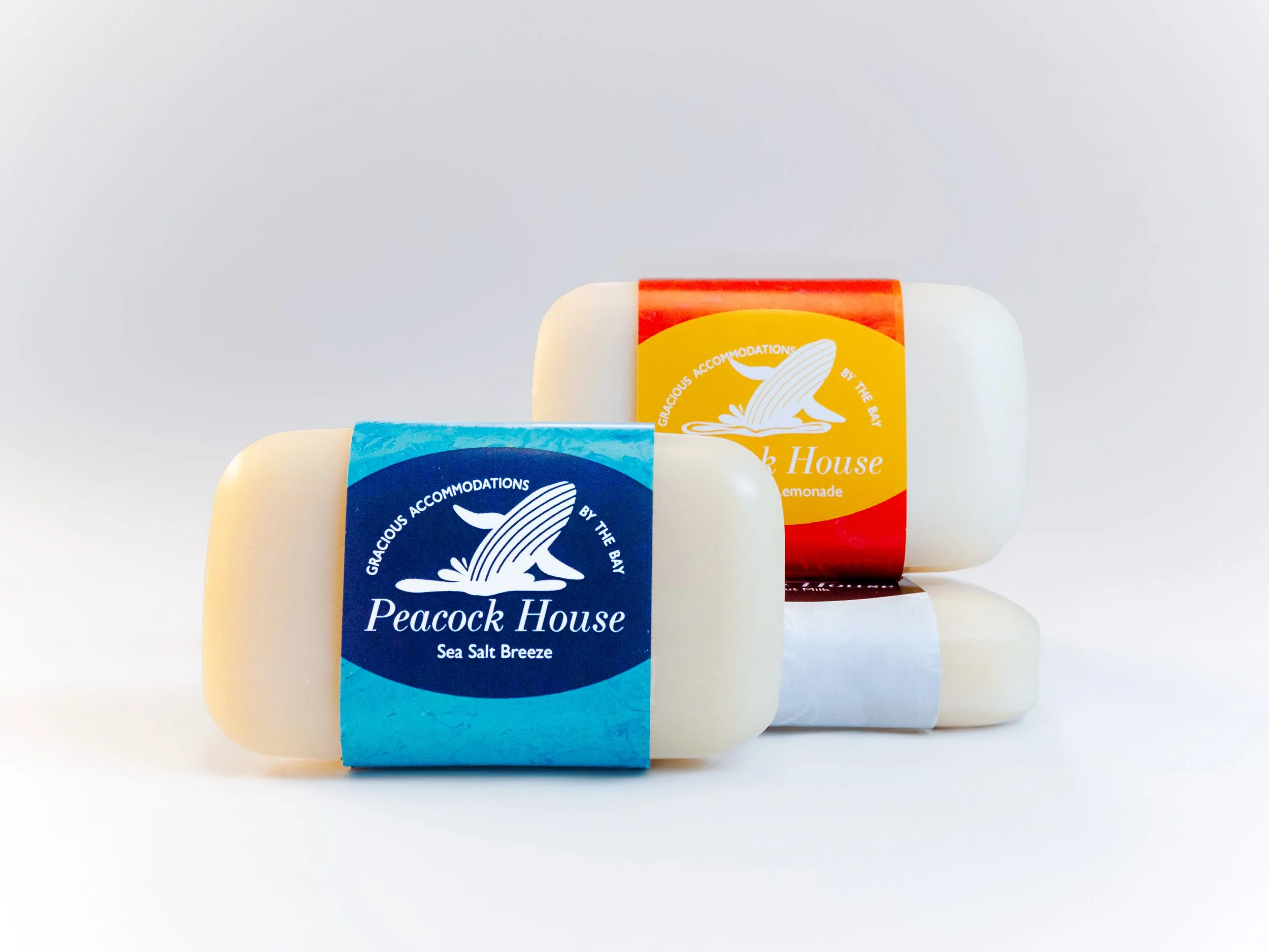
The logo and soap labels were created as part of a branding project for a bed and breakfast business in Lubec, Maine, called the “Peacock House.” The name originates from the surname of a man known as “Peacock.” As such, it was one of the primary design requirements for the logo to avoid depicting the animal. Therefore, I focused on crafting a design that reflected the charm and character of this quaint retreat.
The Peacock House offers guests a serene escape from the busyness of life and technology. Visitors are often drawn to this location by its serene nature and opportunities to whale watch and hike. True to its ethos, the Peacock House serves only products made from scratch with locally sourced ingredients — including their organic, homemade bar soaps.
Drawing inspiration from the soothing colors of sea glass found on Maine’s shores, I incorporated a color palette of beach-like hues into the soap labels. Each label’s color scheme complements the specific scent of the soap and features a watercolor texture to compliment the integrated logo of a whale for the coastal experience. Additionally, I developed the soap packaging, designed to hold up to six bars, ensuring it aligned with the theme. This cohesive approach captures the essence of the Peacock House while providing guests with a beautiful and memorable keepsake.
Peacock House Bed & Breakfast

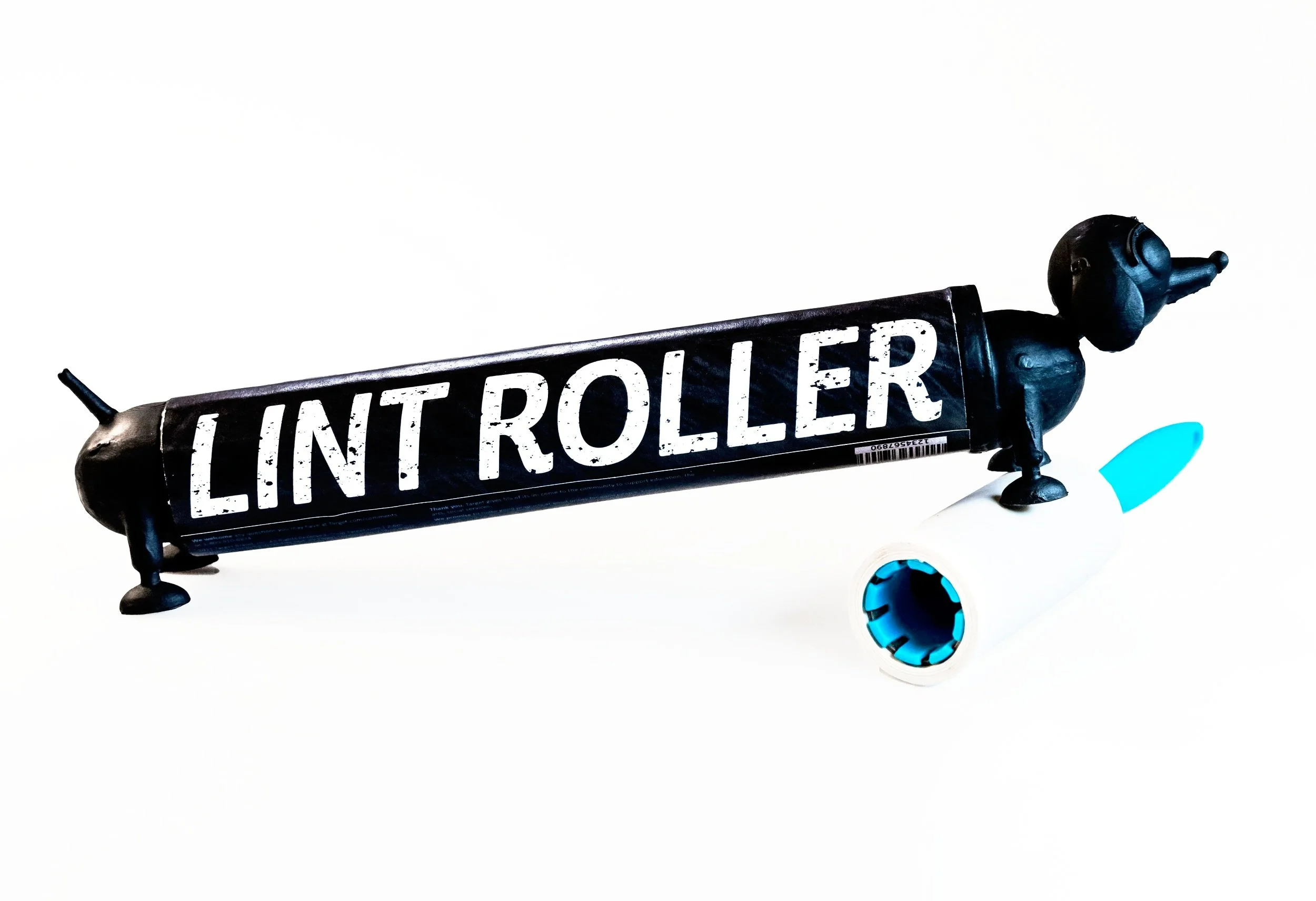


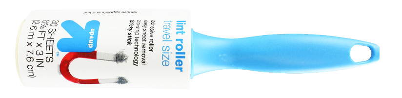
The Lint Roller for Pet Owners
-
The original Target lint roller packaging was a simple paper wrap that left the sticky surface exposed once removed, leading to wasted product and a messy appearance. It also lacked a strong connection to pet owners — its key audience — and its cylindrical shape made it prone to rolling off surfaces.
I redesigned the packaging as a protective container, preventing waste, improving stability, and enhancing its visual appeal. The playful dog packaging and textured, “dirty” typography highlight its purpose and appeal for pet owners, while a compact, travel-friendly design ensures convenience and a lack of wasted product. The updated packaging aligns form, function, and aesthetics, making it a more practical and engaging choice.