
publications.
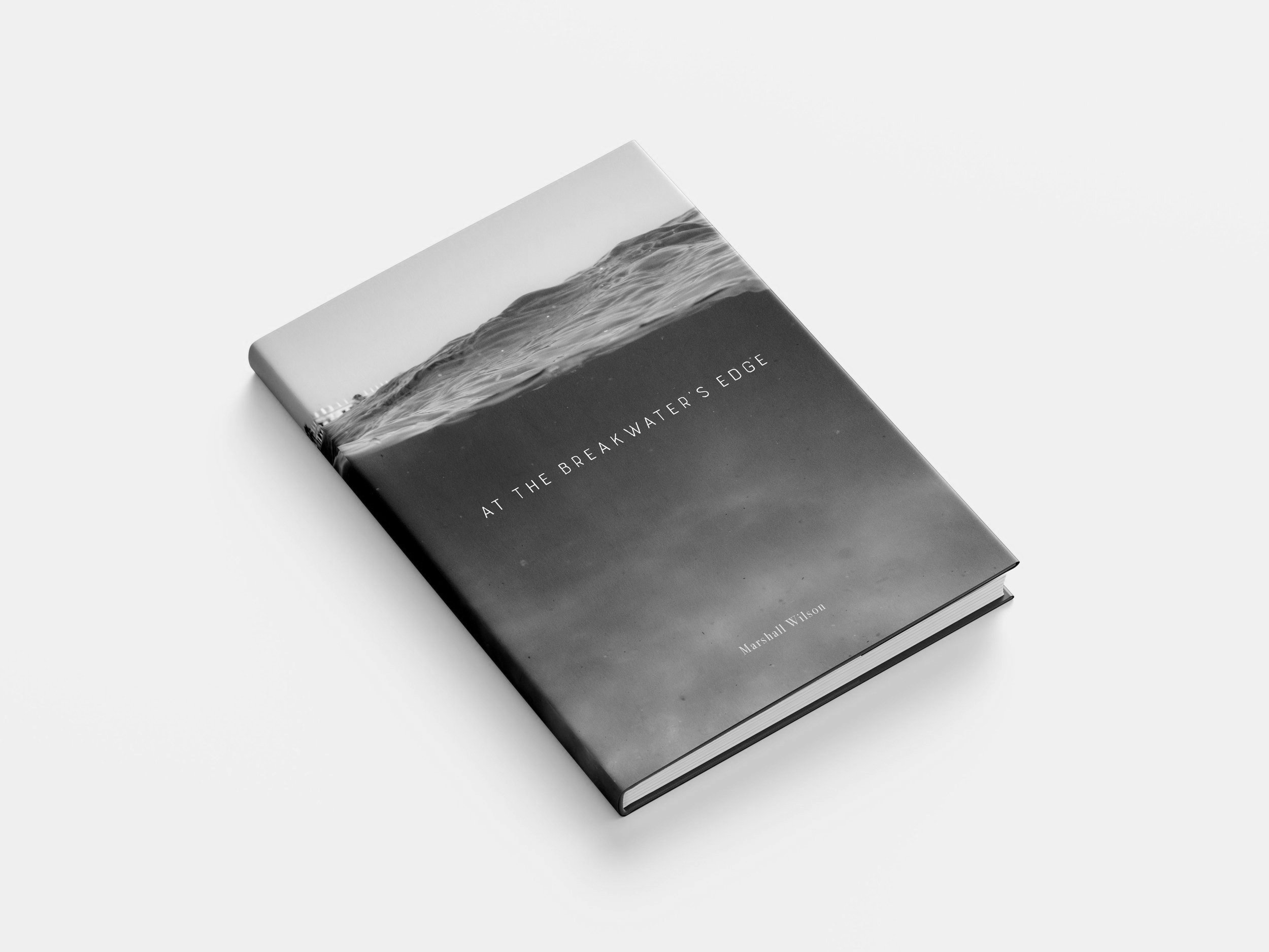


At The Breakwater’s Edge
-
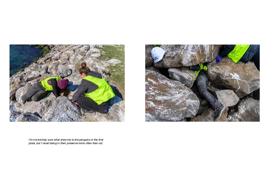
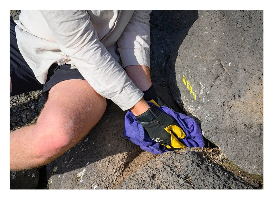
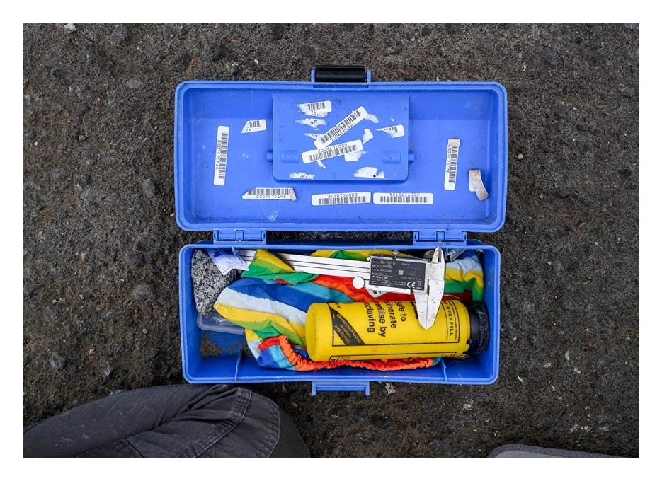
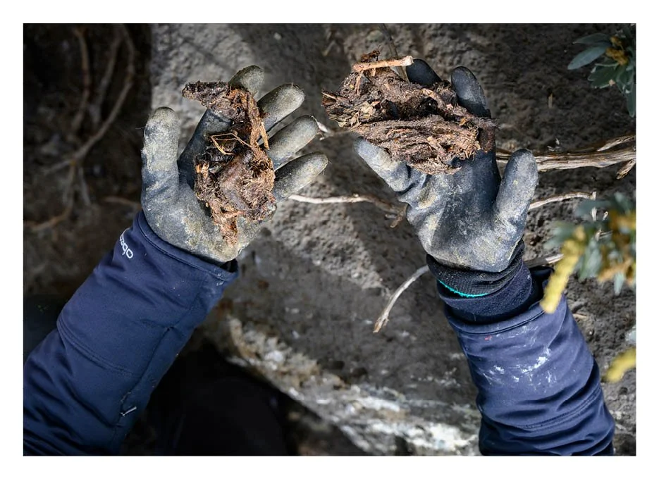
In one of Melbourne’s busiest suburbs lives a colony of the world’s smallest penguins—the St. Kilda Little Penguins. Despite challenges like pollution, boat traffic, construction, and human activity, this resilient colony adapts and endures with the help of Julia Morais, a dedicated marine conservationist and PhD student who has monitored the colony for over the last two years. This documentary series provides a glimpse into the colony’s lives by showcasing their environment and the dedication Julia demonstrates in determining their future.
The design of this book draws inspiration from HOPE by Cristina Mittermeier, INDEFINITE and sketchbooks by Mandy Barker, and most notably, Mick Sowry’s Great Ocean Quarterly, which beautifully blends design, typography, imagery, and storytelling to honor the relationship between humans and the ocean.
Following this approach, I incorporated quotes from Julia to guide the narrative, using a clean layout that allows the images—presented in pairs or full-page spreads—to complement her words. Fine art and documentary photography are interwoven with design elements inspired by her fieldwork and personal notes, creating a visually cohesive and immersive storytelling experience.
Explore more about my insights and research on this series:


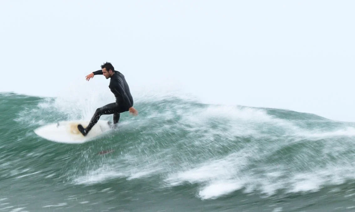
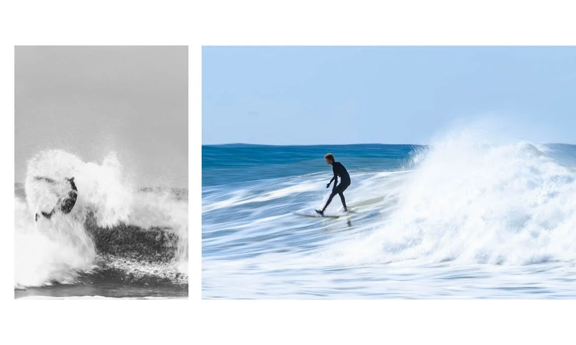


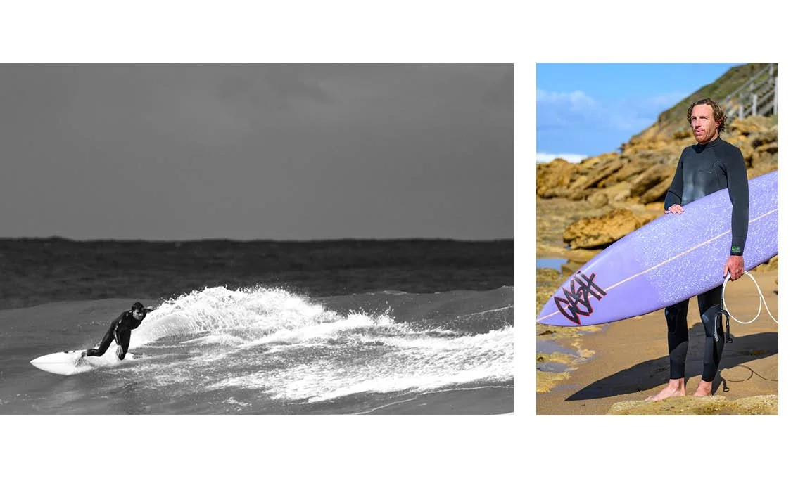


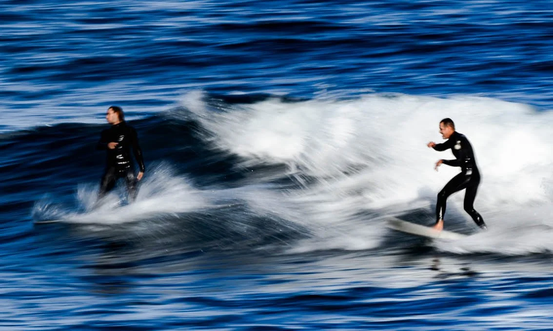


Dawn to Dusk
-
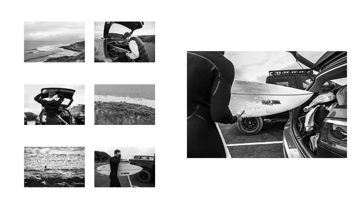
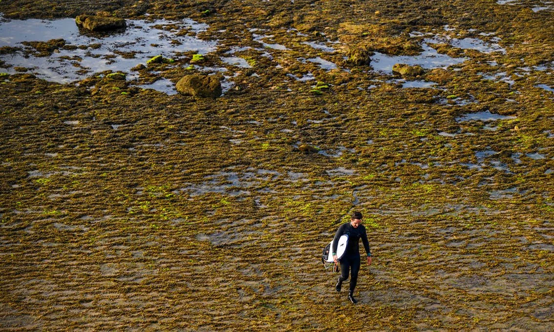
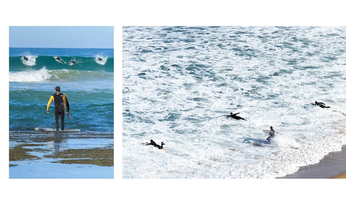
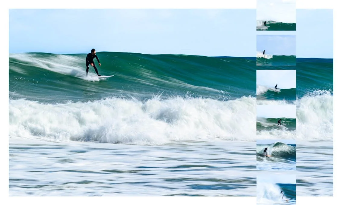
Dawn to Dusk is a self-produced photobook capturing Victoria’s surf culture and the deep connection between surfers and the sea, regardless of the season. The imagery highlights moments of harmony and contrast between the two.
Inspired by the photobooks of John Respondek and Chris Burkard, as well as Surfer magazine, the book blends dynamic layouts with personal touches—such as a hand-drawn illustration of my partner, a local surfer who guided me along the Great Ocean Road. A mix of full-bleed images, varied frames, and consistent three-layout repetition reflects the sport’s diversity while maintaining a cohesive design.
Explore more about my insights and research on this series
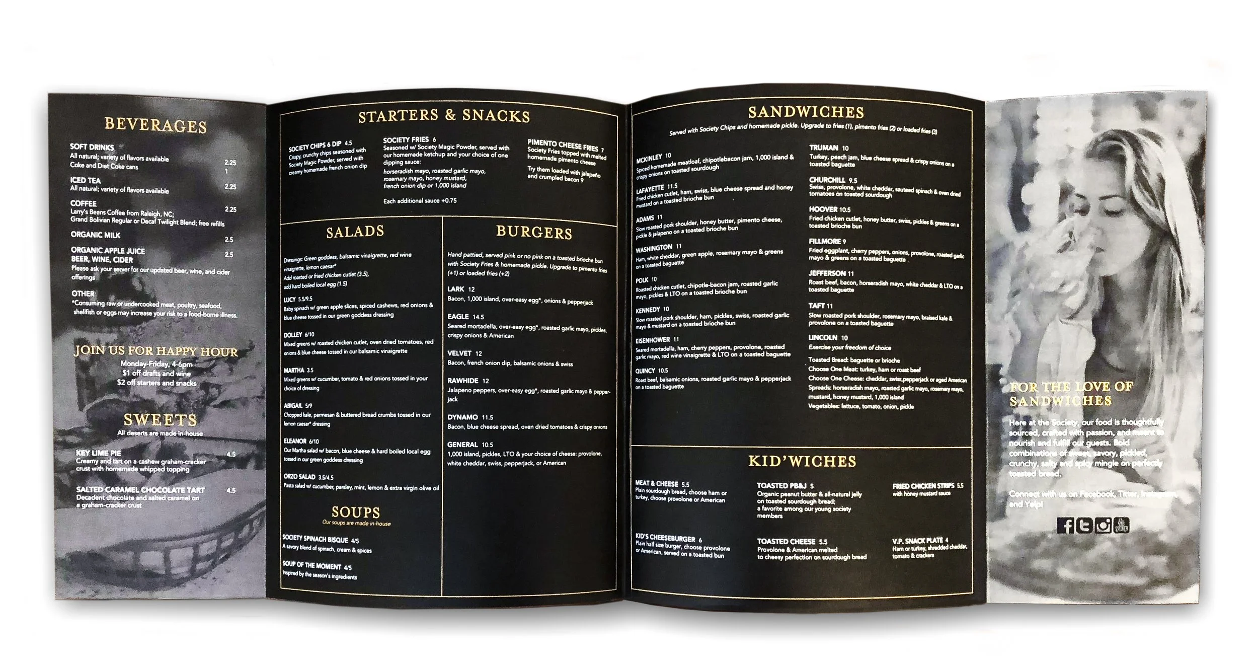

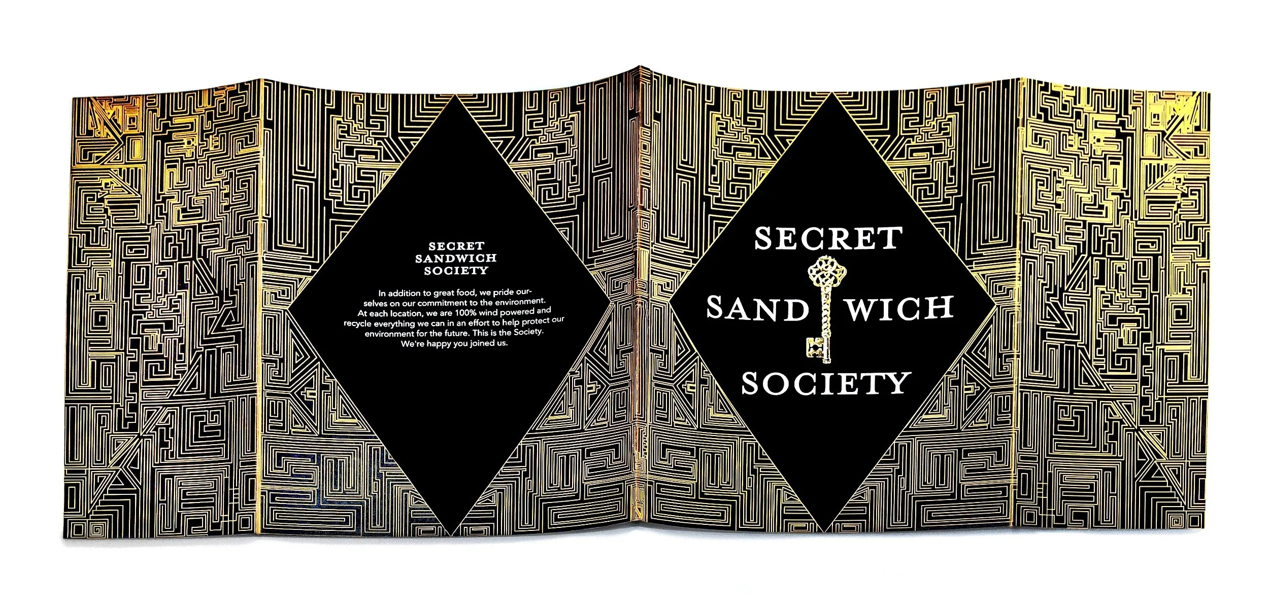

Secret Sandwich Society
-
The menu design for the Secret Sandwich Society draws inspiration from the 1920s, the iconic story of The Great Gatsby, and the secrets woven throughout this era. This time period, often referred to as the "Golden Age," was characterized by secrets, opulence, and a flourishing economy. The narrative layers of The Great Gatsby—from Jay Gatsby's concealed occupation to Daisy's hidden truths—align seamlessly with the mysterious allure of gangsters, speakeasies, and clandestine glamour.
To reflect this theme, the menu design incorporates elements of 1920s fashion and décor, particularly the iconic black-and-gold jeweled dresses of the time and the aesthetic of The Great Gatsby movie cover. A gold maze set against a black background forms the central design, symbolizing the intrigue and secrecy of the era. The sides of the menu fold inward, hiding parts of the content inside, further enhancing the idea of discovery and mystery.
The typography features a thin serif font with varying weights, exuding the confidence and elegance that defined the Roaring Twenties. This cohesive design invites diners into an immersive experience, blending secrecy with sophistication.